To achieve this goal, this client believes a relaxing, light and comfortable website can help, as potential patients can look around, understand the disorders and seek help.
A relaxing, light and comfortable website? How can we make a site like this?
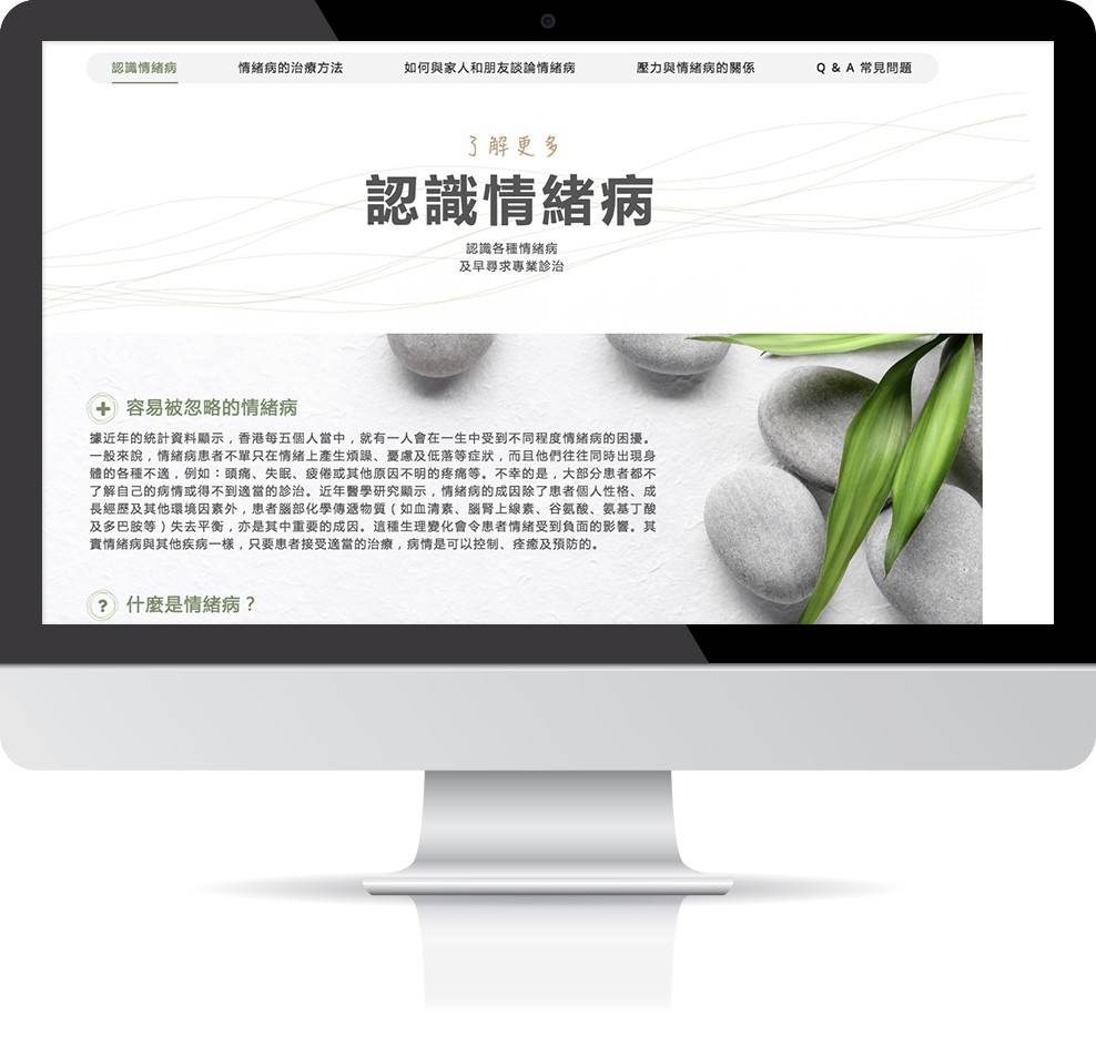
On the home page, our client suggests putting a group of animated curvy lines in the top banner. These slowly-moving lines represent the emotional problems in our mind, which fits perfectly to our client’s work.
We also slow down the website animation for a more relaxing feeling. When you go around the website, banners, texts, images, and even the contact forms are fading in slowly and consistently. When users are viewing these, they feel much less rush and overwhelmed.
Apart from animation, we focus our attention also on selecting images that match our clients’ work. On the page about Depression, we hand-picked images that fit the description of depression. These images complement the description and make it more relevant to website users.
Throughout the whole developing process, our colleagues have valuable communication with our clients. Even though we argue about the alignment of text, the color, the banner icons, the speed of the animation, the images used on each disorder detail page, etc, finally we come up with a well designed website that hopefully helps our client achieve their mission.