AB Concept

Craftsmanship

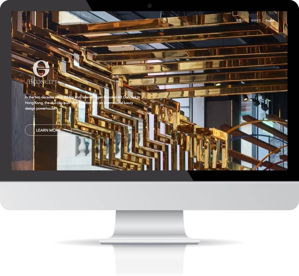
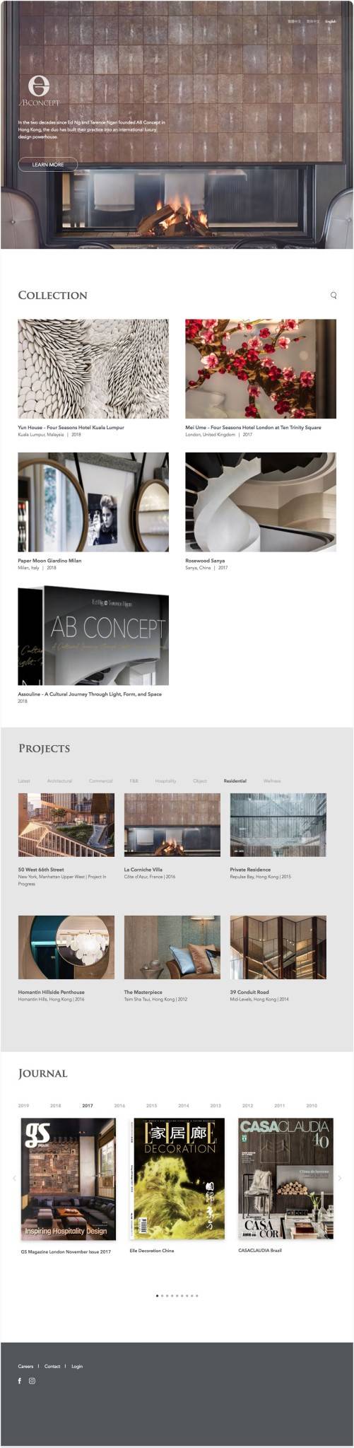
In the two decades since Ed Ng and Terence Ngan founded AB Concept in Hong Kong, the duo has built their practice into an international luxury design powerhouse.
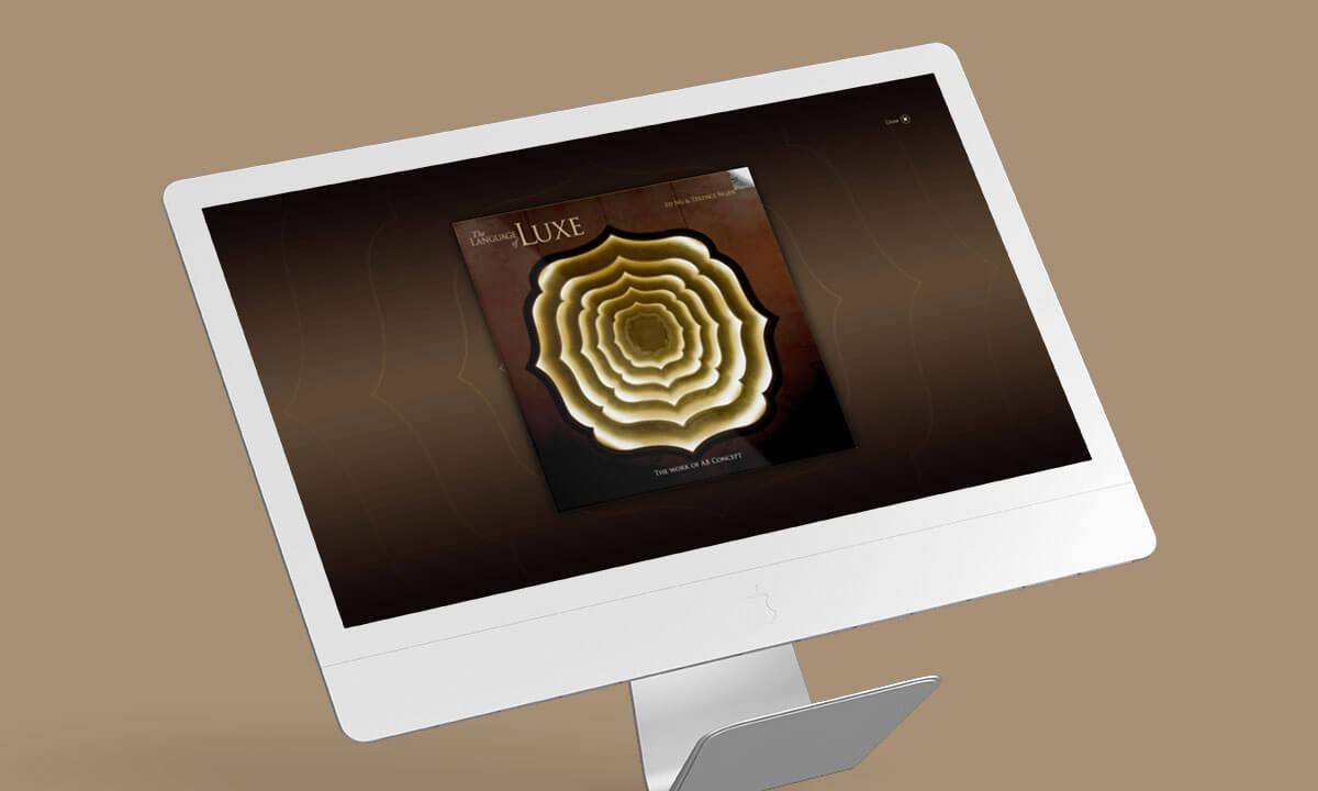
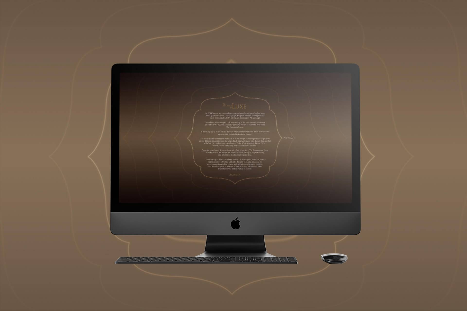
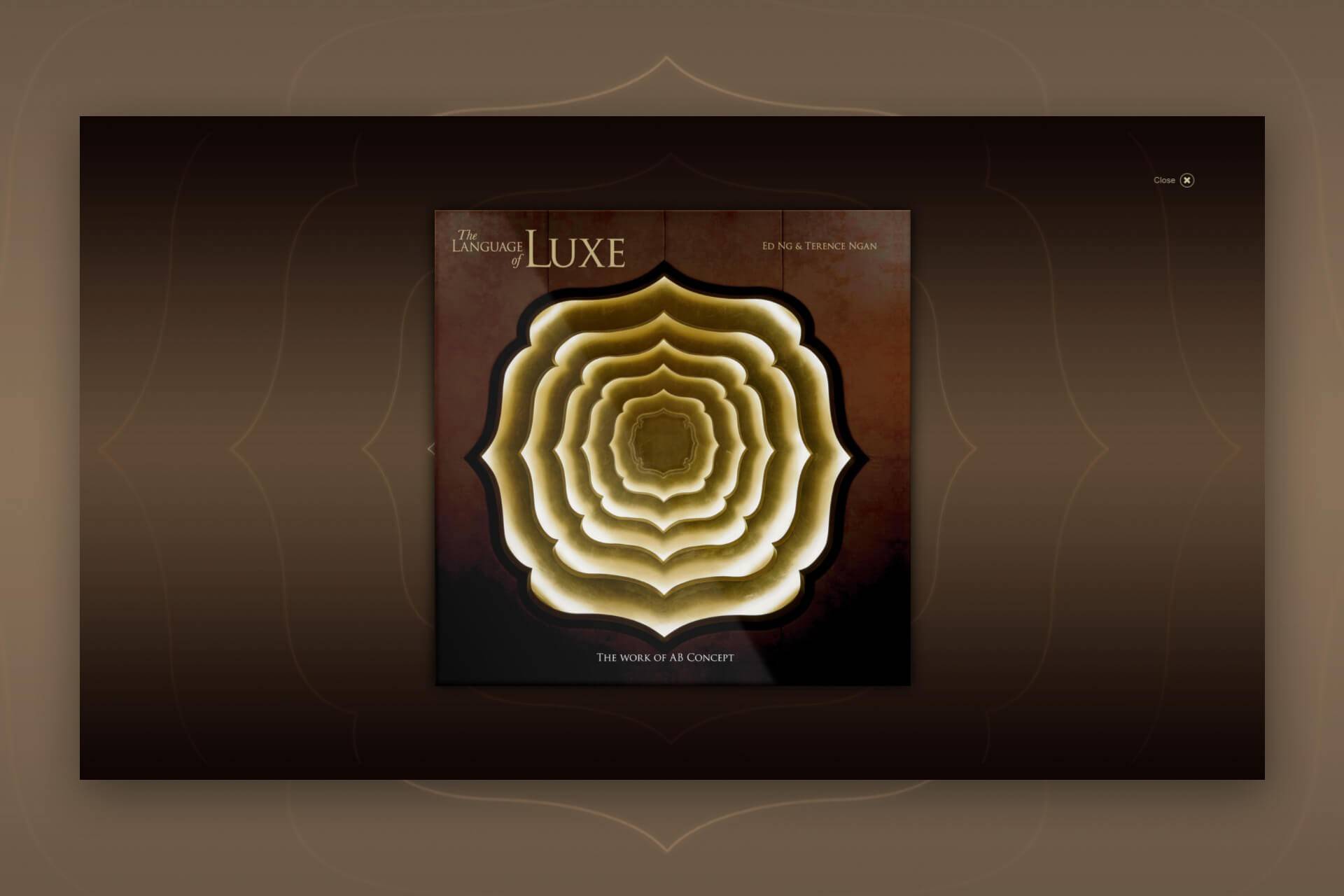
 

abconcept-detailpage-1.jpg


Ed and Terence were our past client. This time they want a complete revamping for their current website. After looking at their project images, we were amazed by the quality of their work.

We have been serving numerous clients from the architectural and design sectors. But this time, these two clients want something different. They not only want to show the impact of their projects with splendid project images, they also want these materials to be displayed seamlessly and simplistically. In this way, visitors of this site can naturally focus on their images, and hopefully the tiny little details inside each project image.


abconcept-detailpage-2.jpg

To display project image seamlessly and simplistically? What does this mean? How can we achieve these? Together with our clients, here are the answers we came up with.

Page number is our first target. Normally website featuring architectures and interior designs place their content in multiple pages. As each page has different designs, visitors need time to digest the design and navigate between pages, and this distract users from focusing on the content.


abconcept-detailpage-3.jpg


Our clients instead come up with a 3-pages design, including home page, career and contact. All projects and journals are placed inside home, so that when visitors come in, they can scroll down and view projects in only one single page, without being bothered by a lot of clicking.

Images are our second target. Ed and Terence chose the best project images for this website. Each image is then refined, retouched and resized to show the best possible angle of the project.


abconcept-detailpage-4.jpg


The display of project detail page is our third target. Instead of a simple popup covering the whole screen, the content of the project detail takes up only 60% of the popup width, while the remaining area stays transparent. This gives visitors a feeling that they are still in the same page and can go back to the single home page in a mouse click.

Great design takes time. That’s why during the development process, we patiently absorbed client opinions and crafted the details together: the font choice, the slightly different font size for each language, the maximum numbers of project photos, the animation. All of these add up to this final product: a simple but impactful website.

SHARE

DONE